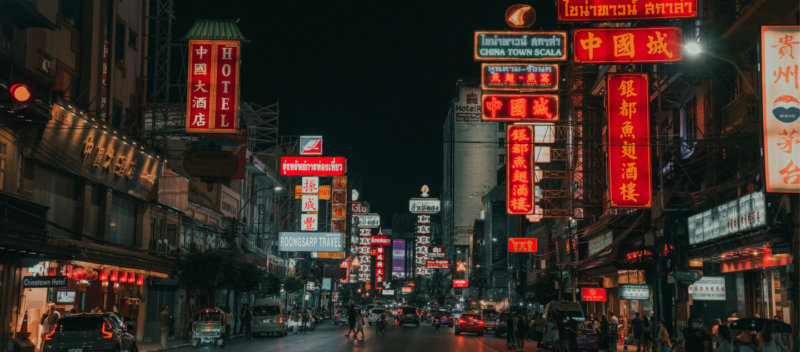

ASAI Bangkok Chinatown is opening soon, and we can’t wait for you to experience it. While we get everything ready, let us take you on a tour of the hotel, with some commentary by the designer himself. In this conversation with Wit Chong from Open Air Studio (the team behind the interior renovations) you’ll get a glimpse of what ASAI Bangkok Chinatown has in store, and learn what it takes to create a beautiful inside space.
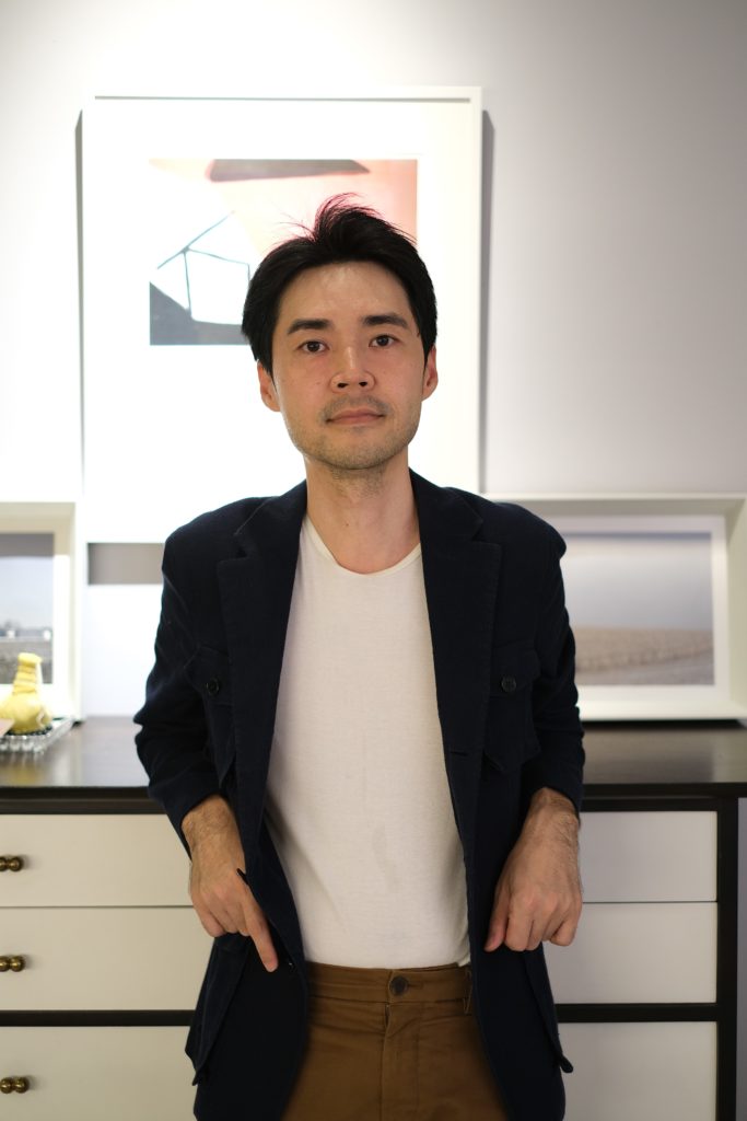
I started out studying interior design in the faculty of architecture at Chulalongkorn University. Then, I continued my studies at the Art Institute of Chicago, before heading to New York for my career. I spent a few years moving back and forth between New York and Chicago, working in the interior design industry for companies like YabuPushelberg and AvroKO. I moved back to Thailand in 2011, opened Open Air Studio and I’m still here.
It’s a nine-year old company with six employees.
We don’t think we’re over-stretched, though. We try not to do the same phase of different projects at the same time, so that we can alternate between them. Normally, we work on eight projects a year, some small and some big. ASAI is considered a medium scale project. Other current works include projects in Jakarta in Indonesia, Ningbo in China and Dhaka in Bangladesh.
As for ASAI, we heard the news from one of my friends, who was working with Dusit. So, we pitched the portfolio and got the job to renovate both ASAI Chinatown and ASAI Sathorn.
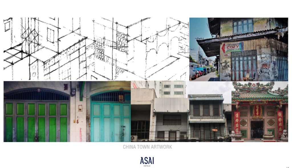
At its core, ASAI is a hotel that’s inspired by its neighbourhood and what they want is localness. So, before getting to the design process, the crew and I looked for inspiration around Yaowarat. We snapped some pictures and took them back to the office to discuss. When we think about Yaowarat, we see various temples and those distinctive row houses that have been turned into stores, be it gold stores, diamond stores, rope stores and so on. These stores, from an architectural point of view, are from the same era; the floors are palazzo style, and the buildings are from the 60s. When combined with temples that are 100 years older, they create a unique mixture of style. We tried to capture this mix in the furniture and artworks displayed in ASAI.
The whole process was pretty quick. We started out in April 2019, and it took us around six to eight months to finish. Designing took three to four months and drawing the construction plan took three months. The plan was finished around October/November 2019, and that’s when construction started.
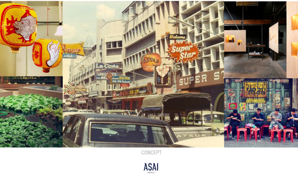
Rather than directly using what we saw, we adapted. There are many obvious examples. The first one is the polished stone bench in the reception area. If we look at the old row houses, one prominent feature is the polished stone bench either in front or on the first floor. We overscaled the piece of furniture, and added a motif of a round opening, which is found in Chinese architecture, famously in the form of a moon gate. It’s also decorated by a graphic drawing of the neighbourhood, so the finished work is truly a combination of the local influences.
A similar idea is used in the guest rooms. Inside, we only have three pieces of furniture: a bed with an oversized headboard, an outsized bench and a minibar wardrobe. The bench is also adapted from the Chinese bench used in the neighbourhood. We stretched it so that guests can sit on it, leave their luggage on it, or use it for decoration. This reflects the warmth and hospitality that brings people together as a community, which is also part of ASAI’s brand identity.
Another obvious example would be the folding doors between the bar and the courtyard. In the brief, it was made clear that there would be a space for outdoor activities like growing vegetables and hanging out. So, we wanted to be able to connect the indoor and outdoor space. The folding doors are found in colonial row houses everywhere in southeast Asia, Bangkok included, and they are useful for connecting spaces. Generally, they’re taller and thinner compared to other styles of folding doors. If the weather outside is good, opening them will give a new feeling to the same space.
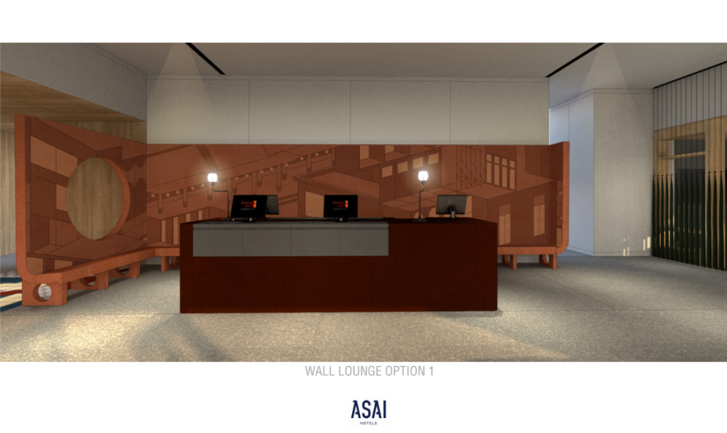
We play with the idea of space a lot. The reception area, for example, is actually quite a big room, but we chose to define the spaces rather than closing them off. Hence, the overscaling. The stone bench helps distinguish the reception area while maintaining the feeling of a continuous path. At the bar, it’s a similar idea. We want to design a sitting space that would refer to the round and oval openings again. So we merged the bench, the wall and the ceiling into one big piece, so the bench is the ceiling as well. In a way, you are surrounded on all sides with the same piece of furniture.
I guess you could say we use objects to define spaces. The furniture will embrace you, so when you sit down you will feel cosy and want to stay a bit longer. Also, we use a lot of real wood, because personally I think it makes the space feel warmer.
As I said, we don’t want to use the elements we found in the neighbourhood directly. That would be looking backward, and what we want instead is to move forward. That’s why we modernise a lot of the design motifs we see. We also don’t want the space to be too Chinese or leaning too much on any specific nationality. We want it to be a combination of various aesthetics, be they colonial, Chinese or modern. The mixture is the heart of this project.
That’s why we didn’t choose what’s already available in the market or what was in the hotel before the renovation. The old hotel rooms were decorated with a painting hanging over the headboard, but they were generic paintings that didn’t reflect anything local. Nowadays there are more local, custom-made pieces available. It fits with our concept to use furniture and artworks specifically created for the hotel in order to reflect the neighbourhood.
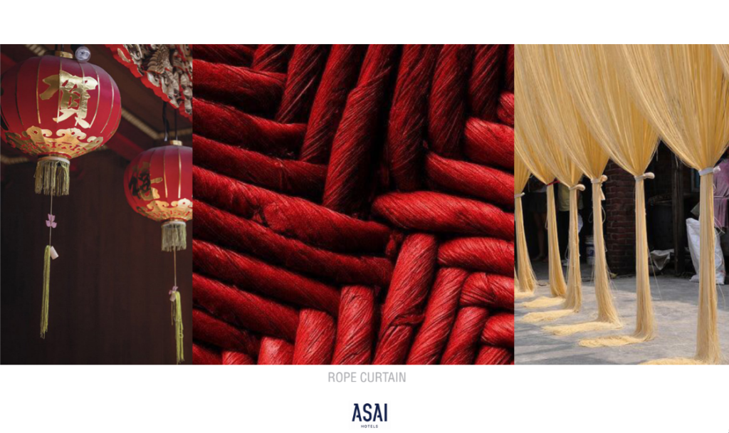
Let’s start with the most prominent motif: the rope curtains. The design is inspired by the tail of Chinese lanterns. We worked with a local artist, Gong from Ease Studio. He’s an expert in art on fabric, printing and ropes. At first we were going to use only ropes, but Gong suggested mixing the thread spools into the work as well. We spent months together developing them into what you see. They are used to divide the spaces, so that they won’t be too empty or naked, while also serving as decorations.
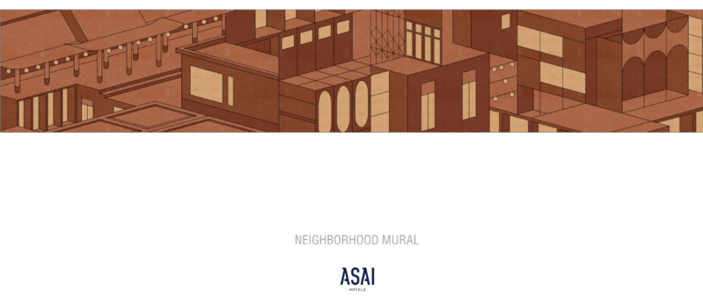
The mural on the wall of the reception bench is inspired by the neighbourhood as well. The facades of the row houses in Chinatown are made of concrete, and we turned the iconic scene into a graphic painting. We sent the painting to the craftspeople, and had them carefully work on it section by section, before glueing all of the pieces together on a plywood board, then put the whole board onto the wall.
Another example of artwork in the hotel is the tiles. For this project, we have decided to use tiles as a motif, since they are found abundantly in the neighbourhood. We had the dining room floor tiles custom-made into octagon shapes and hand-painted by craftspeople in Nakhon Pathom. While for the guest rooms, we used tiles made from lampang on the closet. Tiles of various colours were arranged to create a pattern, similar to what we usually see at the base of a pagoda.
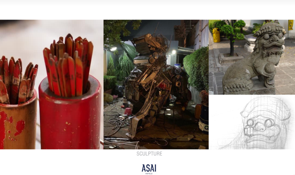
And then there’s the lion. Chinese temples usually have stone animals in front of the gate for protection and greeting. We adopted that idea quite directly for our entrance, but added a twist. We worked with the artist Eric Tobua, who made the masks for the Masked Singer Thailand, and had him create an artwork from recycled materials. Eric is good with fanciful and colourful works, so the finished piece is really outstanding.
Personally, I think it’s a combination that reflects a blend Asian cultures, so not really just Chinese. But I don’t think people seeing it like that is a negative thing. If you think it’s Chinese, then fine. I think it’s cool that people experience the design differently.
I don’t really like defining my design style. Describing it alone already takes hours, and I use tons of references while explaining it. I think sticking to a certain style is less important than having a thorough thinking process. I’m confident that we really put a lot of thoughts into it and my description reflects those thoughts.
I’m not the kind of designer who checks everything with Feng Shui, since my main focus is on the spaces, but I do agree with many of its principles. For example, having a mirror at the end of the bed, or opening a door to a mirror, those things are not ‘good’ both in Feng Shui and in a design sense, and we tend to avoid them. Or, having lots of aligned doors is not ‘good’ because it creates a constant flow of people, and the energy in the room becomes restless.
Very. It turned out well–beautiful–with a strong character. When we design, sometimes we’re afraid that it might turn out soulless, without identity. But it didn’t. It reflects the brand and our identity too. So it’s a win.
We’re also designing the Food School at Samyan, which is another project by Dusit. It’s a chef-based community space, which will house various styles of cooking schools, including Thai, Japanese and Italian, among others. They call it an incubator, where chefs get to experiment with new recipes.
I also teach at ABAC, but only one course per year. I spend one afternoon per week teaching Design Methods for sophomore students. It gives my brain a chance to rest and do something else. Talking to students is pretty refreshing, because they have a different thinking process. Also, my course is workshop based, so the class is more like an exchange of knowledge and opinion. It’s not about what’s right or wrong, but rather about how to develop your ideas.
My usual advice is to do what you love, find your passion, right? Personally, I don’t really think about design all the time. I don’t work all the time. I haven’t worked until midnight or worked on weekends for a long time. I think balance is important. You have to rest and think about other stuff as well, so that when you get back to work you’ll feel fresh again.
On the other hand, I still want to become a better interior designer. In every project, there are things I want to improve. I don’t feel like I’ve reached the peak of the design field yet, and that’s why I keep working. It’s not that this is my one and only passion that keeps me from doing other things, but more like right now I’m still enjoying and wanting to get better.
Hard to say, because I change it all the time. I change the design according to my mood of the day. Sometimes I go to bed, and when I wake up the next morning, I want to change it again. More importantly, I think my current habitat reflects who I am. Whatever’s in the house should reflect who the resident is.
With Wit Chong’s explanations, our beautiful spaces become even more fascinating. As we’ve discovered, every corner is full of thoughts and stories, all waiting to be discovered.
We believe in living local and that idea is reflected perfectly in the neighbourhood-inspired design. With its mixed cultural style, the hotel will inspire each visitor differently, according to their background and attitude. Some might feel the strong Chinese influence, and others might fall for the minimal style. If you want to know how your experience will be, the best way is to come and check it out. ASAI Bangkok Chinatown is open for booking, so click here and make plans to visit
